

Douglas Driving school Logo.
The Douglas Driving School logo is a bespoke lettermark constructed around a capital D.
.

The Douglas Driving School identity grew from the visual environment in which the business operates every day: British roads.
Rather than reproducing an existing traffic sign, the logo takes familiar ingredients—strong geometry, a circular enclosure, high contrast, directional symbolism and highly legible letterforms—and turns them into a distinctive D.
The letter is simultaneously a monogram and a directional symbol. Separating its vertical stroke and terminating it with an upward-facing triangular arrow transforms the initial into a visual representation of progress.The learner is going somewhere.
From Sketchbook to Sign.
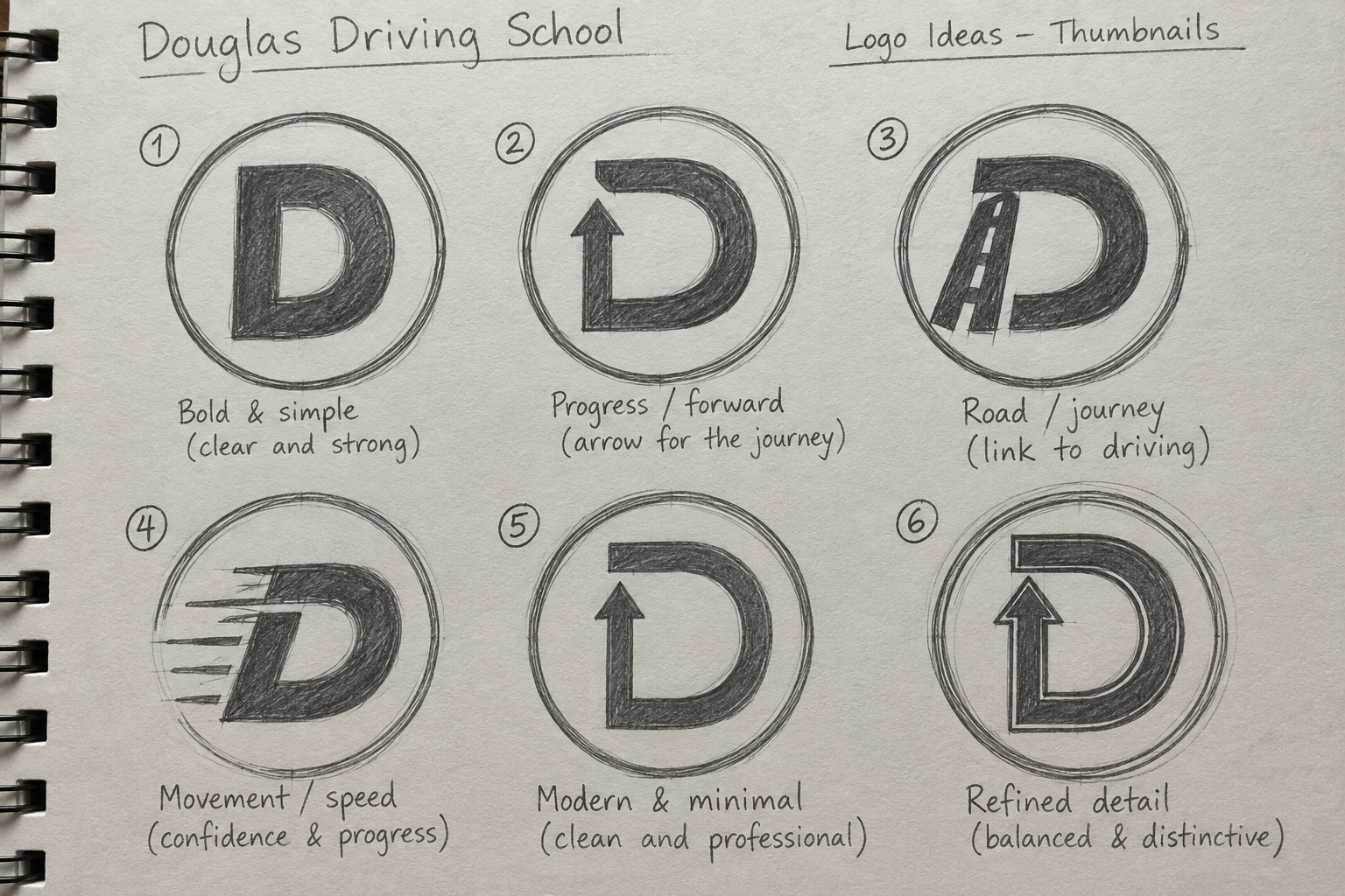
Early graphite sketches investigated several interpretations of the D: a conventional letterform, a roadway, movement and speed, a directional arrow and increasingly simplified geometric forms.Keeping this stage deliberately rough made it possible to concentrate on the idea rather than polish. The strongest direction combined the D with an upward arrow.
That solution expressed three parts of the brand at once: Douglas, driving and progress.
As the design developed, unnecessary details were removed and the relationship between the arrowhead, vertical stroke and horizontal arm was adjusted. The final mark became closer to a pictogram: something intended to be understood before it is consciously examined.
Inspired by Britain's Road-Sign Language
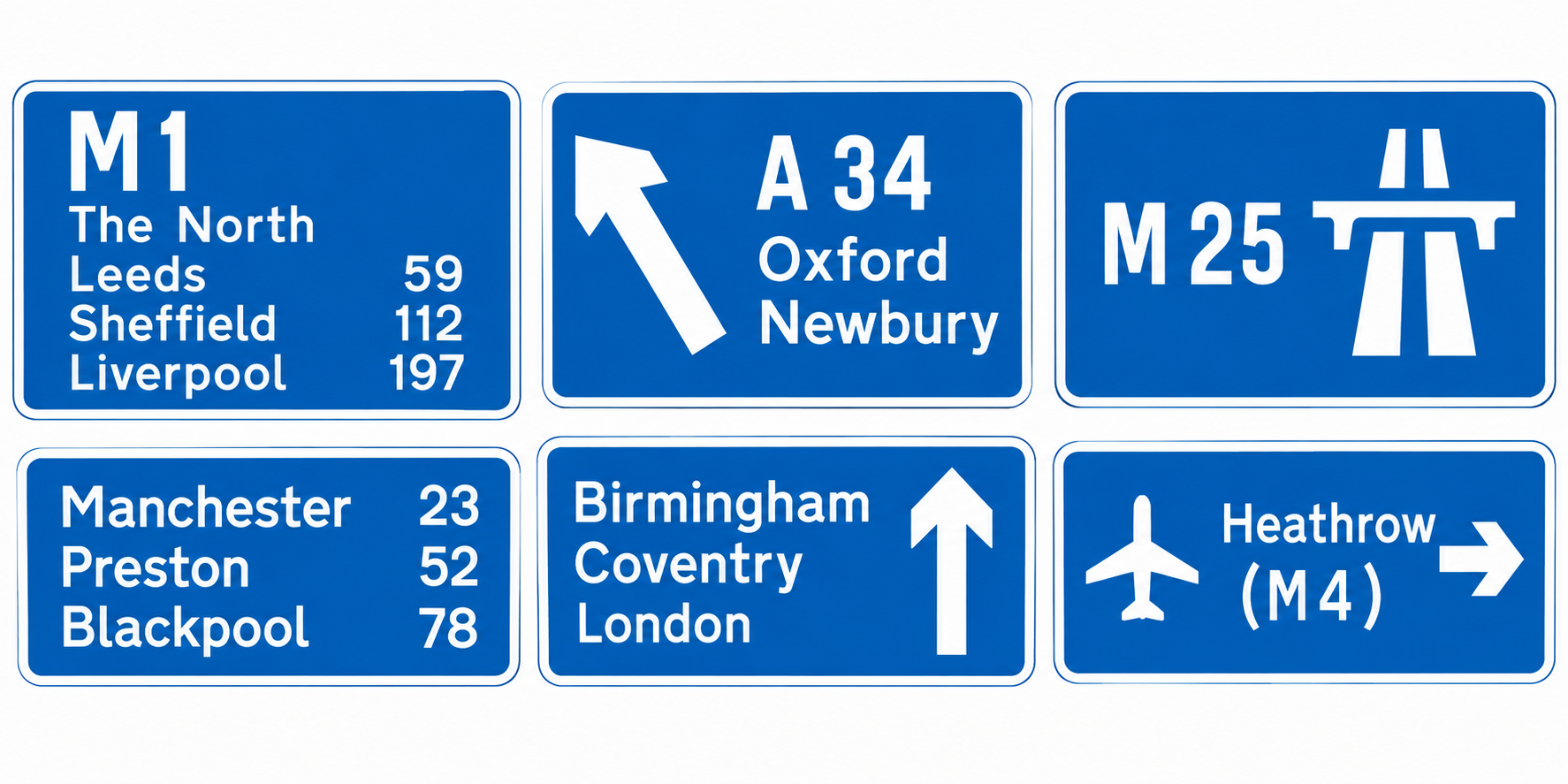
The wider influence comes from Britain's road-sign system and the work of designers Jock Kinneir and Margaret Calvert.
Their approach to road signage established a visual language based on clarity, consistency and rapid recognition. Those same principles make an unusually good foundation for a driving-school identity: the viewer may encounter the Douglas mark on a phone, a business card, a website or briefly on a vehicle.
The identity therefore favours large uncomplicated forms, strong contrast, generous negative space and minimal visual noise.
The result references British road culture without pretending to be an official road sign..
Colour palette.
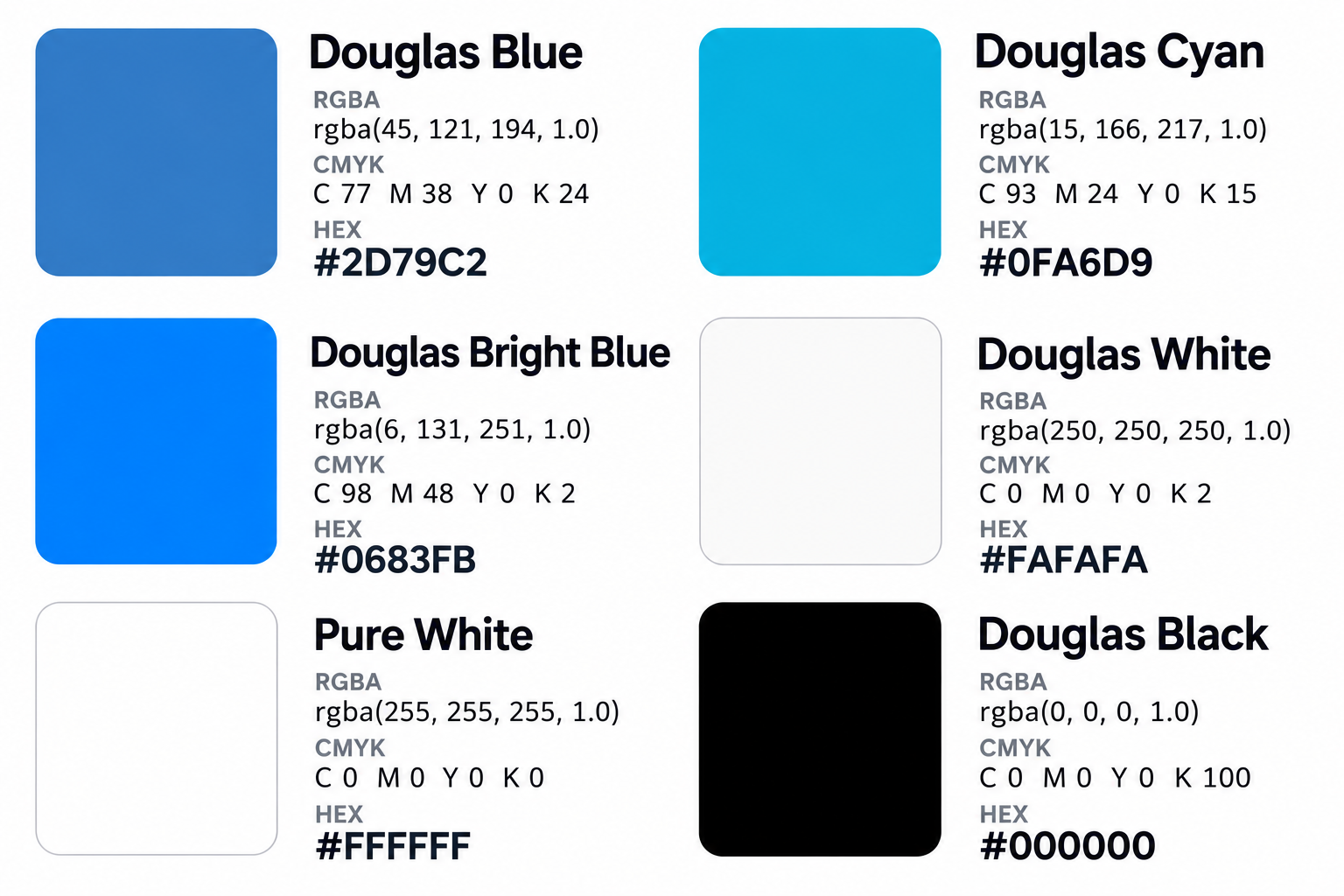
The darker blue establishes trust, stability and a visual connection with British directional signage.The brighter cyan introduces energy and gives the traditional road-sign influence a more contemporary digital character. The white Used for the D, circular border and light interface surfaces. The slight reduction from pure white provides a softer appearance while retaining strong contrast. The pure white used primarily as the website and presentation background.
Typography
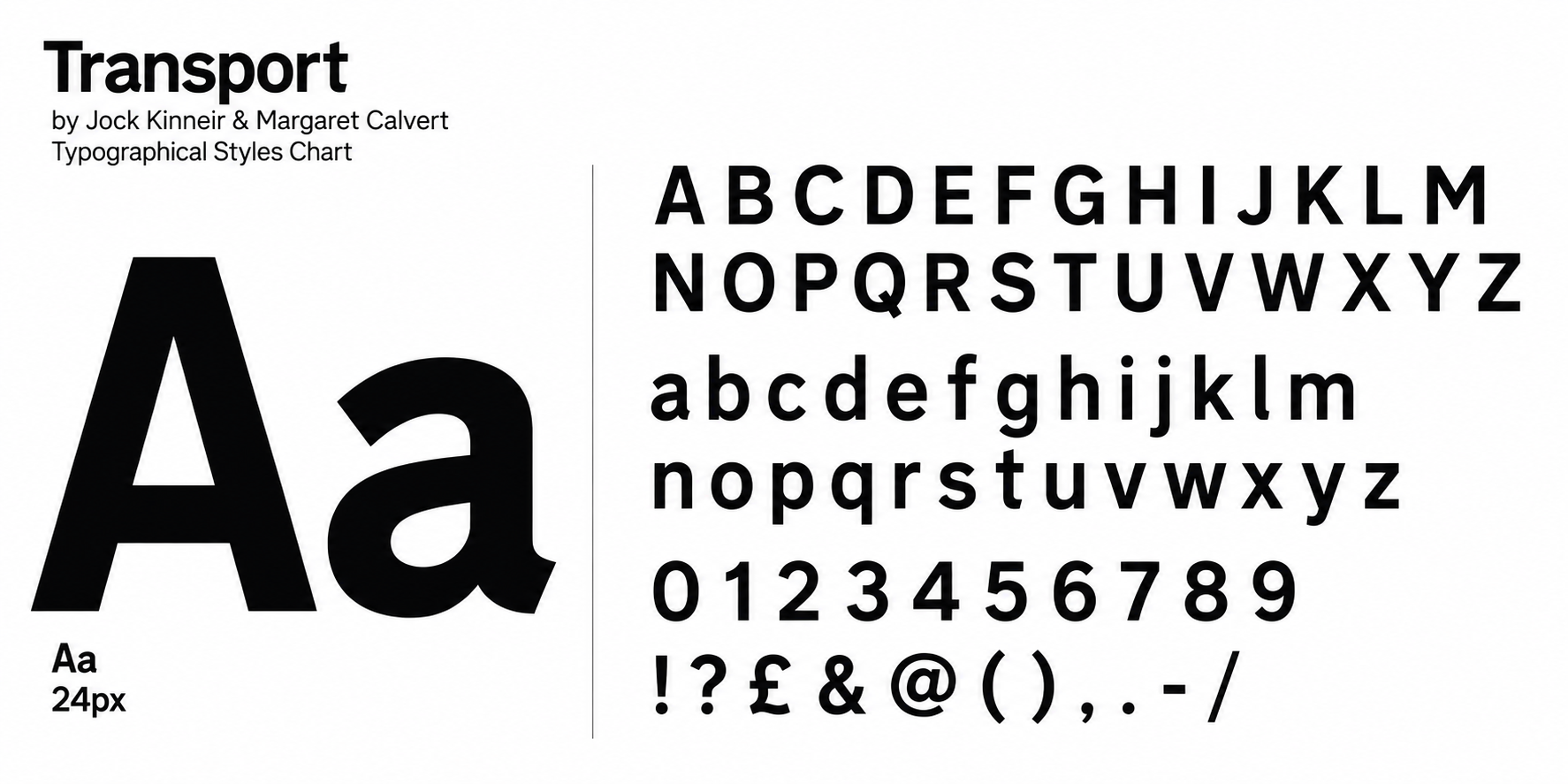
Transport provides the conceptual typographic foundation of the identity.
Created for Britain's road-sign system by Jock Kinneir and Margaret Calvert, its clear sans-serif forms complement the Douglas philosophy: information should be easy to recognise and understand.. Rather than copying an individual traffic sign, Douglas adopts the principles behind the system:
Clarity · Legibility · Economy · Recognition · Consistency
These principles are particularly appropriate to a driving school. Road signs need to communicate information rapidly to people who are moving through an environment. Likewise, the Douglas identity needs to remain recognisable on a moving tuition vehicle, a mobile screen, social media or roadside advertising.
The result is intentionally British in character without looking like an official government or regulatory symbol.