Where creativity meets clarity, and vision meets action.
Driven by curiosity and built on purpose, this is where bold thinking meets thoughtful execution. Let’s create something meaningful together.
Logo Design Brief
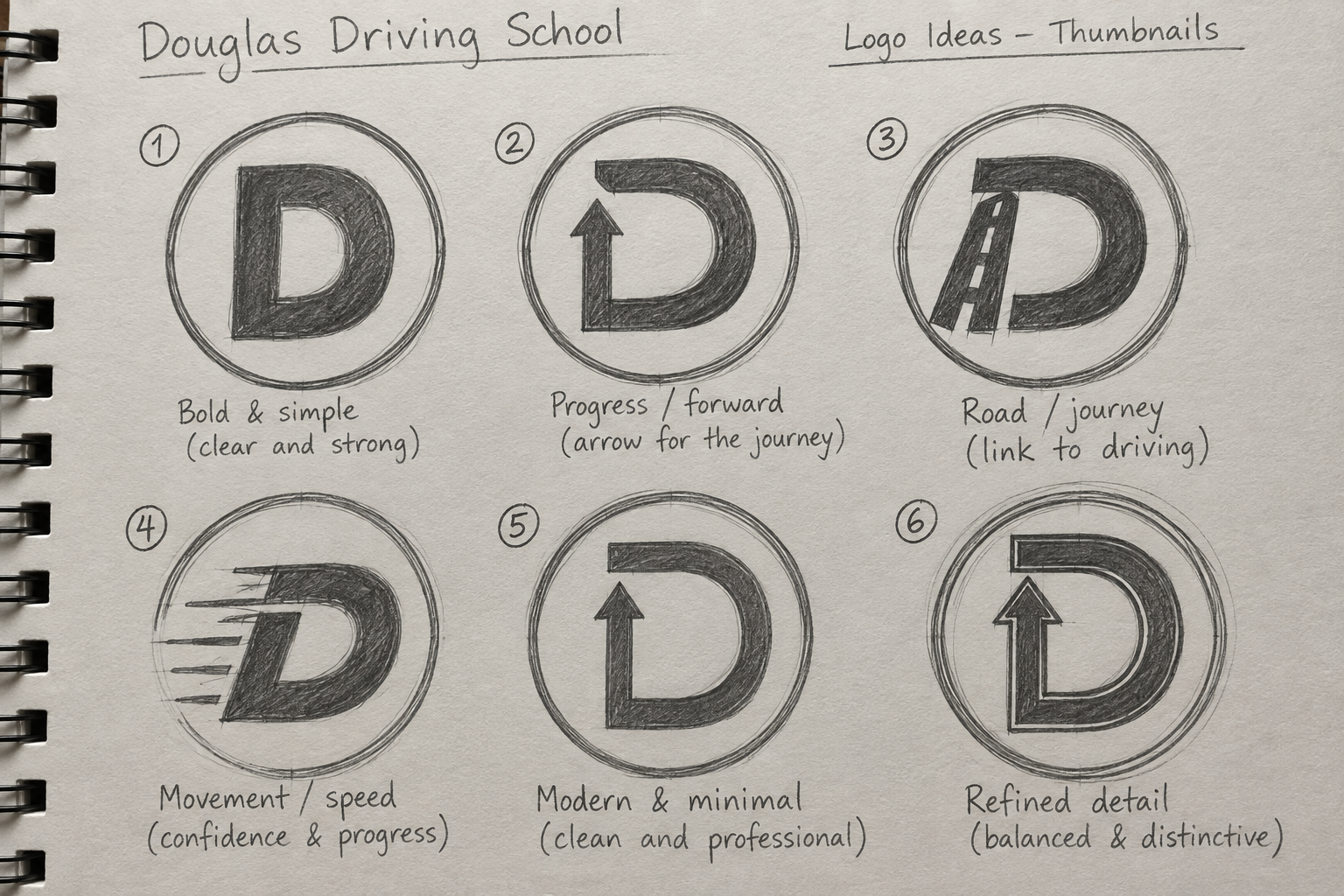
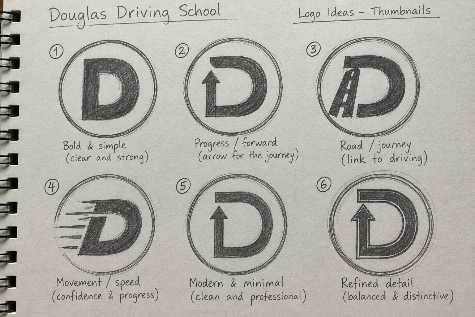
The Douglas Driving School logo is designed to create a clear, confident and approachable brand identity for an independent Manchester-based school of motoring. Inspired by the visual language of British road signage, the circular form, strong white border and bold letter “D” give the identity an immediate connection to driving and the road. The upward arrow integrated into the letter suggests progress, direction and moving forward, reflecting the journey from learner to confident, independent driver. The blue gradient adds a contemporary character while communicating trust, calm and professionalism.
Learner drivers in Manchester.
The primary audience is learner drivers in Manchester and the surrounding areas, particularly new and younger drivers who may feel nervous about getting behind the wheel. The identity therefore avoids looking overly corporate or intimidating. Instead, its simple geometry, familiar road-sign influences and bright colour palette create a brand that feels reassuring, memorable and modern, supporting Douglas Driving School's central promise: “Taking the stress out of learning to drive.”
A familiar language for a new generation of drivers
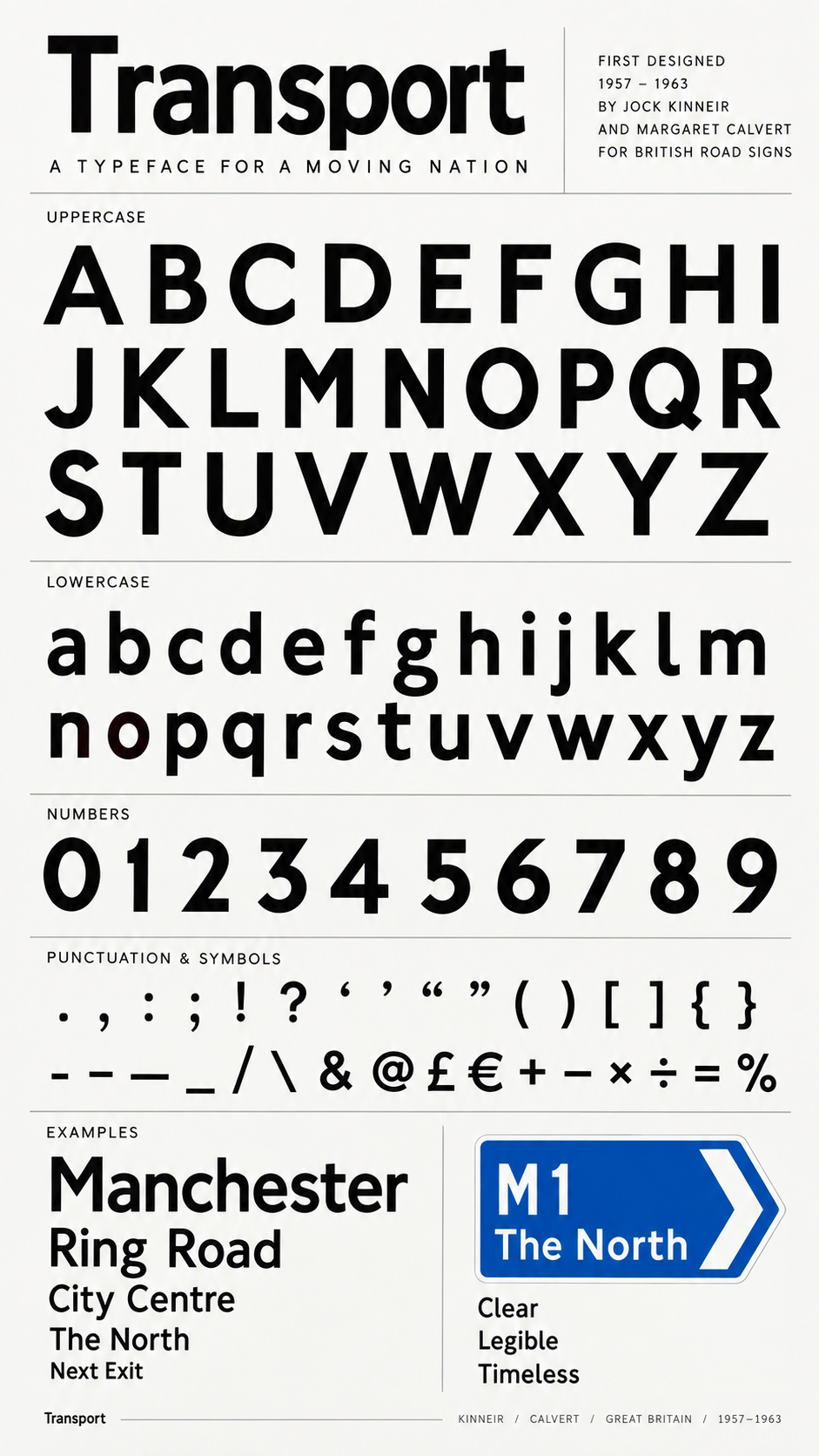
Douglas Driving School needed an identity that felt modern and distinctive while remaining immediately connected to learning to drive in Britain. The project looked to something much more fundamental: the visual language of the British road itself. The resulting identity takes its cues from the road-sign system developed by Jock Kinneir and Margaret Calvert, combining a circular sign-like structure, a modified letter D, an upward directional arrow and a blue palette to create a compact symbol for direction, progress and confidence.
Our Services
Explore our range of services designed to help you move forward with confidence, wherever you're headed next.



Meet the Team
-
![A woman with short blonde hair wearing an orange sleeveless top and beige pants, sitting on a padded bench and writing in a notebook, with sunlight casting shadows on the wall and a large green houseplant nearby.]()
Monet Goode
FOUNDER
With a vision for building something meaningful, our founder brings a blend of big-picture thinking and hands-on experience.
They set the tone for everything we do. -
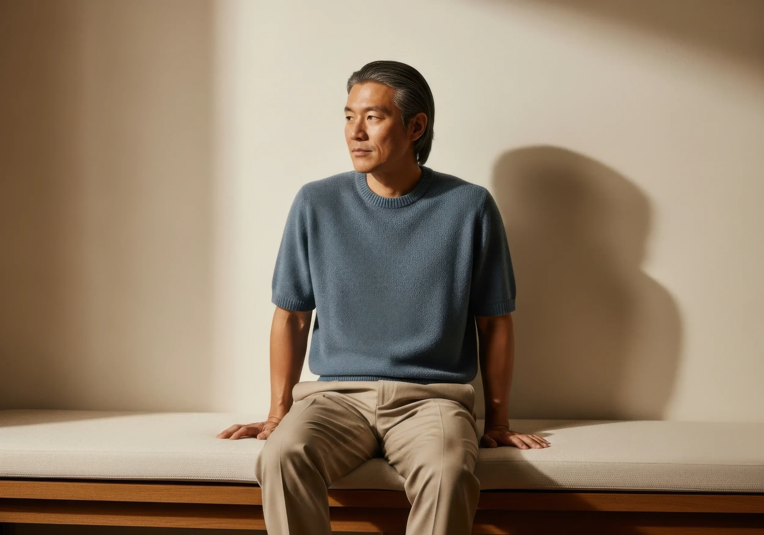
![A man with gray hair is sitting on the edge of a bed, wearing a blue sweater and beige pants. He is sitting with one knee up, the other leg down, and one hand resting on the bed while looking to the side against a plain beige background.]()
Emmett Marsh
SALES MANAGER
Focused, approachable, and driven by results, our sales manager is all about building strong relationships. They help connect people to the right solutions—with clarity and care. -
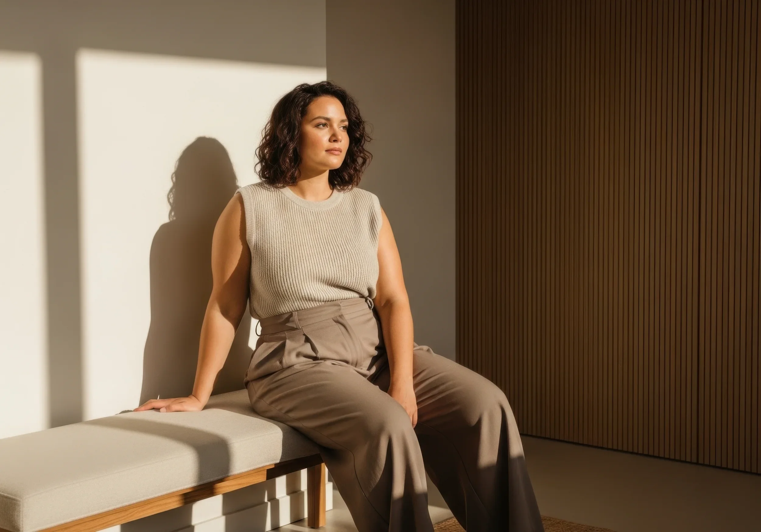
![A woman with curly hair sitting on a bench in a warmly lit room, leaning against the wall with her eyes looking to the side.]()
Eleanor Parks
MARKETING DIRECTOR
Creative and strategic in equal measure, our marketing director brings fresh ideas to every campaign. They turn insights into action and help our message resonate with the right audience. -
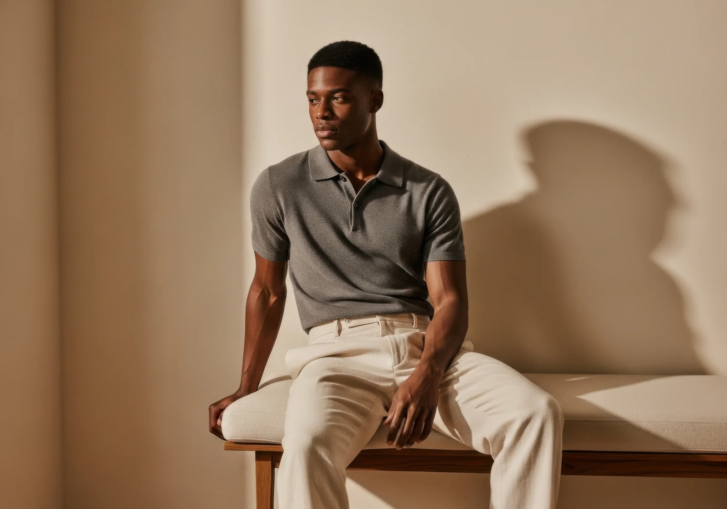
![A young man with dark skin sitting on the edge of a wooden bench in a neutral-colored room, wearing a gray polo shirt and cream-colored pants. Shadows cast on the wall behind him create a stylized silhouette of another person.]()
Karl Holland
CUSTOMER SERVICE MANAGER
Friendly, attentive, and always ready to help, our customer service manager ensures every interaction is a positive one. They keep communication clear, timely, and human.